| 147 DVA Design in Context Coursework (Cw) - 64 | |
| Module Mark (Mm) - 64 | |
| Grade (Gd) - PASS | |
| Credits (Cr) - 20 I am fairly pleased with this result, only 6 off a first which is what I would have like to have got but that would mean producing a very high standard of professional work which I don't believe that i am there yet, I am still learning and understanding how to use the different types of software like InDesign, Illustrator, Quark Express etc, as these are all still very new to me I am still very much in the learning process, hopefully in time once I am familiar with the programs I will be able to produce a higher quality of work. |
Tuesday, 3 May 2011
147 DVA Design in Context Marks.
149DVA Typography Marks & Reflection
The typography project was split in the two parts, the first was to create a box and pick a story from that weeks news and show that story using the inside of the box. The box had to have at least one side open and couldn't have things outside of the box, we also had to create a 3D letter which would fit inside of the box - we had to choose the size, material and colour used carefully as we had to make it justifiable to why we had used it.
I decided to do something lighthearted and make it fun, I picked the story of Robbie Williams rejoining Take That after being split from them for 10 years and it also being the first time the 5 of them had preformed together in 10 years. I used the box to create a small studio with a stage - this was the X-Factor stage where they preformed together, I then made 5 mini card bored cutouts of the 5 members and had them standing on the stage, I had lights fitted to the box to make it bright and playful with shiny paper and glitter to make it big and bright like the X-Factor stage was. I had T as the letter and made it from cardboard which I then covered with mini money that I printed off, it was said that the 5 of them were each set to make over a million each in the first year of beinf reformed so I wanted to make a point of this.
I was quite please with the finished piece and thought I had stuck to the brief well, however I did think that I could have done better if I had put a bit more time in.
The second part was we were each given a different interpretation of the same story, they had all been written in different styles, or by a different persons personal point from the story. My version was written as question and answer, what was most probably a person being questioned by some kind of authorial figure such as the police. The person was being asked what they had seen, how it made them feel, what they thought was happening etc, which the questions being answered. It was a formal piece of writing which has been written in fair detail.

Although 58 is a fairly good mark I am a little disappointed as I was have liked to have got higher, however I suppose it is a fair grade to the work I submitted, because I didn't really enjoy the second part of the project I found It had to get in to, I also really struggled using InDesign as it is a software I am unfamiliar with. Instead of spending the time producing a high standard of work, I was spending my time trying to figure out how to use the program.
I decided to do something lighthearted and make it fun, I picked the story of Robbie Williams rejoining Take That after being split from them for 10 years and it also being the first time the 5 of them had preformed together in 10 years. I used the box to create a small studio with a stage - this was the X-Factor stage where they preformed together, I then made 5 mini card bored cutouts of the 5 members and had them standing on the stage, I had lights fitted to the box to make it bright and playful with shiny paper and glitter to make it big and bright like the X-Factor stage was. I had T as the letter and made it from cardboard which I then covered with mini money that I printed off, it was said that the 5 of them were each set to make over a million each in the first year of beinf reformed so I wanted to make a point of this.
I was quite please with the finished piece and thought I had stuck to the brief well, however I did think that I could have done better if I had put a bit more time in.
The second part was we were each given a different interpretation of the same story, they had all been written in different styles, or by a different persons personal point from the story. My version was written as question and answer, what was most probably a person being questioned by some kind of authorial figure such as the police. The person was being asked what they had seen, how it made them feel, what they thought was happening etc, which the questions being answered. It was a formal piece of writing which has been written in fair detail.
For my research I looked at formal pieces such as police statements online – the layout of them and the fonts used to help me for my initial ideas. My original idea was to rewrite the text as a police statement, set out as questions followed by the answers, but after trying this out it looked boring, I wanted to make my piece more interesting. I went on to research other things related to investigating an incident. I started looking at lie detector graph results (polygraphs), and what they looked like. I decided for my final design I would set my work out like a polygraph, with the questions set out to form the table, and the answers creating the graph results. Although the questions and answers were in order to match one another, to help define which went with which I alternately changed to the font between regular, bold, italics and bold italics. This made the graph easier to understand. I think my work is successful as it is a clever way of showing the cross examination of a witness being questioned. The polygraph is an interesting way of showing the results going up and down as the witness is being interrogated by the police.

Here is an example of the style of how my work was set out because unfortunately I can't open the file on my laptop.
149DVA Typography 1
| Coursework (Cw) - 58 | |
| Module Mark (Mm) - 58 | |
| Grade (Gd) - PASS | |
| Credits (Cr) - 20 |
Although 58 is a fairly good mark I am a little disappointed as I was have liked to have got higher, however I suppose it is a fair grade to the work I submitted, because I didn't really enjoy the second part of the project I found It had to get in to, I also really struggled using InDesign as it is a software I am unfamiliar with. Instead of spending the time producing a high standard of work, I was spending my time trying to figure out how to use the program.
150DVA Visual Communication Mark & Reflection
| Coursework (Cw) - 68 | |
| Module Mark (Mm) - 68 | |
| Grade (Gd) - PASS | |
| Credits (Cr) - 20 From the Visual Communications Module which is the module which I did the first 5 weeks from when I started university I got 68 which I was really pleased with, its only 2 marks off a first which for my first piece of work I thought was really good. I was really unsettled when I first started trying to remember my way around, get to know people on the course, try to remember my log in and passwords for everything etc, so I wasn't entirely focused on the word because I had so much else going on at the time, so I was please with this mark, although I wish I had added a little something extra which would have gained me those extra two marks! |
Illustration Mark & Reflection
| Coursework (Cw) - 60 | |
| Module Mark (Mm) - 60 | |
| Grade (Gd) - PASS | |
| Credits (Cr) - 40 |
I got 60 for my Illustration module, I am quite pleased with this as I don't think my drawing is as strong as the others in the group so I wasn't expecting a very high mark, I think that I may have made my mark higher by having good ideas that fit to the brief each week.
I hope that my illustration work continues to improve as obviously it is an important part of design, I will do this by lots of practice and trying different styles of drawing until I find my own style which I am most comfortable and confident with!
Sunday, 1 May 2011
Harvard Referencing...
I had my first experience of Harvard referencing when doing the second part of module 147 DVA - The essay. It was something i'd never had to do before, and stupidly I didn't pay attention when it was being explained to us, so when it came to doing it I didn't have a clue where to start. I had to search on google and try and figure it out for myself, I'm still not sure now even after I've handed it in if I did it right or not - but at least I had a go.
I think for the next time we are asked to do an essay I will asked for it to be explained to me again to make sure I do it right. (Serves me right for day dreaming!!)
I think for the next time we are asked to do an essay I will asked for it to be explained to me again to make sure I do it right. (Serves me right for day dreaming!!)
A101DVA - They Won't Bite ... How to work with Creatives
For my Add+ Vantage module I decided to pick 'How to work with creatives', this was where I would learn how to work with and present myself to creatives in the real world. I would gain knowledge in this subject then at the end of the module have to do a presentation in a small group showing what I had learned.
I picked this subject because I find it hard to speak in front of groups of people both socially and professionally, I get really nervous and would do my best to put off having to do it if I could, obviously this isn't idea with the line of work i'm hoping to go in to, in the future I am going to have to present my work and ideas to people in hope to find jobs etc, so this is something I really need to try and getting better at and overcome the nerves.
In each lesson we were taught different skills and techniques to help us understand what we should and shouldn't do when presenting ourselves, and what we should try and do to overcome worrying about doing presentations etc.
Half way through the module we were put in to groups and asked to come up with a new product which we would then have to try and sell to the rest of the group. The product could be anything, we had to give it a name, slogan and present it on a Power Point presentation. The presentation had to be at least 10 minutes long, and each person in the group had to speak, I was really nervous about speaking in front of the class, and was even worried about practicing in front of my group!
I personally thought that my group didn't make enough effort in this project, nobody was interested in meeting and it was all left to the last day or two for us to try and get something together, although I thought our product idea was fun and original we didn't give ourself time to present our idea well, it was rushed and we didn't have enough time to practice. I personally would have liked to have much more of an effort because this was something I really wanted to learn from as I know it's something i'm going to have to start doing more and more and I'm dreading it!
Overall I am glad I pick this Add+ Vantage module as I found the classes quite useful, however I wish that more effort in the group work had been put in.
Friday, 29 April 2011
147 DVA Design in Context
This modules coursework came in 2 parts, brief Part 1: Practical coursework.
We were asked to design the cover (front, back and spine) for a new Penguin edition of James M. Cain’s 1934 novel The Postman Always Rings Twice.
We were also split in to groups of different countries which we would have to design the book for, I was in North Africa.
Before I could even start to think of ideas for the book I needed to do thorough research in to North Africa - the culture, the people, the religions there etc, these factors would all play a huge part in how the cover would look.
I found it really hard to get in to starting the cover, I had a few ideas but nothing I particularly liked. It was a long process getting all my research together and coming up with different designs, and also coming up with designs which I could justify being appropriate for the North African market.

First Cover. Bleeding Rose In Hands.
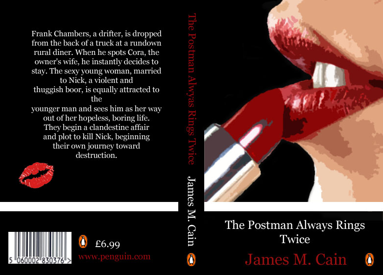
Cover 2 - Womans Lips With Lipstick.

Final design - Cats Eyes.
Brief Part 2: Referenced contextual studies essay
“Imagine that you have before you a flagon of wine. You have two goblets before you. One is of solid gold, wrought in the most exquisite patterns. The other is of crystal-clear glass, thin as a bubble, and as transparent. Pour and drink; and according to your choice of goblet, I shall know whether or not you are a connoisseur of wine. For if you have no feelings about wine one way or the other, you will want the sensation of drinking the stuff out of a vessel that may have cost thousands of pounds; but if you are a member of that vanishing tribe, the amateurs of fine vintages, you will choose the crystal, because everything about it is calculated to reveal rather than to hide the beautiful thing which it was meant to contain. There is nothing simple or dull in achieving the transparent page. Vulgar ostentation is twice as easy as discipline.” From The Crystal Goblet, or, Printing Should Be Invisible, by Beatrice Warde (1900-69), 1955.
“Imagine that you have before you a flagon of wine. You have two goblets before you. One is of solid gold, wrought in the most exquisite patterns. The other is of crystal-clear glass, thin as a bubble, and as transparent. Pour and drink; and according to your choice of goblet, I shall know whether or not you are a connoisseur of wine. For if you have no feelings about wine one way or the other, you will want the sensation of drinking the stuff out of a vessel that may have cost thousands of pounds; but if you are a member of that vanishing tribe, the amateurs of fine vintages, you will choose the crystal, because everything about it is calculated to reveal rather than to hide the beautiful thing which it was meant to contain. There is nothing simple or dull in achieving the transparent page. Vulgar ostentation is twice as easy as discipline.” From The Crystal Goblet, or, Printing Should Be Invisible, by Beatrice Warde (1900-69), 1955.
This is the piece of text we were given and asked What did we think Warde was trying to say, and told that it must be explained it in terms of design and illustration practice and also how relevant are her words in relation to my cover design to The Postman Always Rings Twice; The Doves Press Holy Bible of 1903-5; and The National Express website homepage of 2010.
I found it really hard to get my head around what I was being asked to do, I've found that I seem to make things harder for myself - instead of getting on with things straight away I tell myself that I can't do it and get myself all worried and put off doing it.
I didn't start my essay until 3 days before it was due to be handed in - nothing like leaving it until the last minute! Although i felt really stressed over the three days in a mad rush to get the essay together and set it out like a magazine article I feel that's what I needed to get me in the mind set to do it, I didn't have the time to tell myself I couldn't do it - I just had to get on with it, and I was actually really please with my final piece. Although obviously if I had given myself the weeks I had to do it properly I could have maybe produced something better, I was happy that I got something together to hand in - because at the beginning I didn't think I could have done anything!
Subscribe to:
Posts (Atom)